New mathematical equations co-developed by Puget Sound Institute affiliate research professor Marc Mangel are designed to help health officials interpret coronavirus test results for better risk assessments.
As more people in the U.S. are vaccinated and mask restrictions loosen, public health officials hope that the coronavirus pandemic has reached a turning point. Even so, the virus continues to rage around the world and concerns remain for people who are unvaccinated or may have compromised immune systems. Testing for new infections continues to be a critical tool in the fight against the virus.
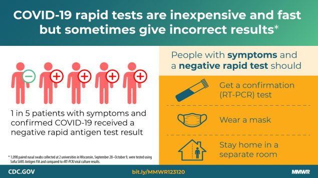
One of the most common coronavirus tests is the rapid antigen test, which can be done without laboratory analysis in as few as 15 minutes. Its speed and convenience are a big plus when dealing with a quickly spreading virus, but the test is prone to errors, sometimes showing false negative or positive results, especially when it is conducted in the early stages of the disease. As a result, just based on testing, it is often difficult to know the true rate of infection in a community.
That’s a challenge for health officials and it can have big impacts on policy decisions. The number of coronavirus cases in a community can help determine when a county allows public gatherings. It can help hospitals assess the need for critical resources like respirators and medical staff. Now, a new mathematical tool developed by Puget Sound Institute affiliate research professor Marc Mangel in collaboration with Alan Brown of Johns Hopkins University is available to help health officials better gauge case rates, and to calculate the risk of exposure to the virus in groups of different sizes.
The method is outlined in a paper released by Johns Hopkins University and describes a series of equations “that can be implemented in a spreadsheet or using a handheld calculator,” Mangel and Brown write, making them accessible to non-mathematicians. Public officials can use the equations to correct for the testing errors and then advise policymakers on where to prioritize resources.
“Suppose a group of people go to a wedding and the next day learn that someone tested positive, so they all go out to get tested,” Mangel says. “Most tests are not as accurate early in the infection,” he says. “Our equation is a way of better interpreting the results of those tests — what the true risk is.”
While the equation itself does not give an exact case count, Mangel says, it allows officials to get closer to the true number of infections by providing reasonable upper and lower bounds for the estimate. The result can be visualized as a curve on a graph. Users can draw horizontal and vertical lines that intersect with the curve based on risk percentage and group size (see the graph labeled “Figure 2” from the paper), although the curve becomes less useful as case rates approach zero.

The equation involves math similar to that used in the fishery sciences, says Mangel, who specializes in mathematical biology and applies mathematics to Puget Sound recovery work. Mangel’s work often spans across disciplines, from cybersecurity to social networks, and now epidemiology. He compares the current equation to one used in juvenile rockfish surveys in the California Current. In that case, for example, there will be a certain number of false positives or negatives when counting fish, and scientists can use similar math to account for identification errors.
“One of the great things about mathematics is that it allows you to see commonalities in systems that on the surface look completely different,” says Mangel who hopes the same equation could be used in the event of other outbreaks of infectious diseases beyond Covid-19. “Next time, we would like to be more prepared.”